Your homepage is like the front door of your online store. It welcomes visitors, shows what you sell, and helps them decide to stay or buy. In just a few seconds, it needs to grab attention and make things clear. How do you create a homepage that boosts sales? This guide shares simple, effective tips to make your web design in Perth stand out and turn visitors into customers.
The Hero Section That Hits Hard
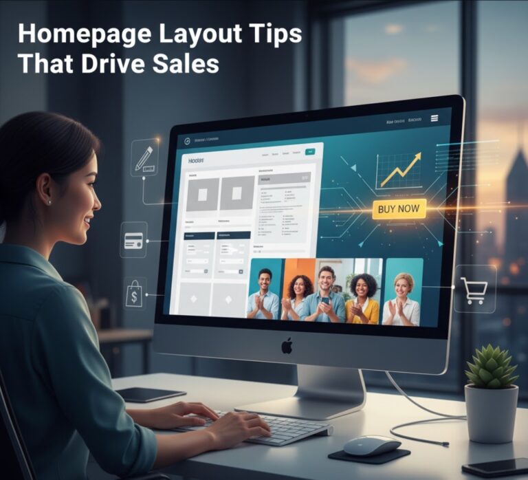
The hero section is the first thing people see when they land on your homepage. Think of it as a big, bold sign that says, “This is who we are!” It uses a clear headline, a short tagline, and a strong image to show your value fast. For example, a pet store might have a happy dog photo with “Find the Perfect Pet Supplies” and a “Shop Now” button.
Keep the hero section clean and simple. Avoid clutter so the message is clear. Make sure the call to action (CTA) button, like “Buy Now” or “Start Shopping,” is easy to see. The background image should support the headline, not distract from it. A great hero section gives visitors a clear direction right away.
Navigation That Guides Without Friction
Good navigation is like a friendly guide who helps visitors find what they need. Place your logo in the top-left corner, where people expect it. Use simple menu names like “Shop,” “About Us,” or “Contact” instead of confusing words.
For example, a clothing store might have a menu with “Men,” “Women,” and “Sale.” A sticky navigation bar stays visible as people scroll, so they can jump to other pages easily. For big stores, a mega menu can show lots of options in neat panels, like shoe types or sizes, without making visitors dig for them. Smooth navigation keeps people moving toward a purchase.
Strategic Use of White Space
White space is the empty space around text, images, or buttons. It’s like giving your homepage room to breathe. Too many things on a page can feel overwhelming, but white space makes everything clear and calm.
For example, space around a headline makes it stand out. Margins around product photos let them shine. Extra room around buttons makes them easier to click, especially on phones. A homepage with good white space feels inviting and helps visitors focus on what matters most.
Visual Hierarchy That Controls the Eye
Visual hierarchy is how you guide a visitor’s eyes to the most important parts of your homepage. It’s like directing a play, deciding what people notice first. Use tools like size, color, and position to lead the way.
A big product image grabs attention, like a shiny new phone. Bright colors, like a red “Buy Now” button on a white background, make things pop. Placing key items near the top or center ensures they’re seen first. For example, a gym’s homepage might show a bold photo of a workout with a smaller “Join Today” button below. This creates a clear path for visitors to follow.
Calls to Action That Pull the Trigger
A call to action (CTA) is a button or link that tells visitors what to do next, like “Shop Now” or “Sign Up.” It’s like a friendly push to take action. Use clear, direct words to make it obvious what happens when they click.
Make the main CTA button stand out with a bright color, like blue or orange, and place it where it’s easy to find, like near the hero section. You can also add smaller CTAs, like “Learn More,” lower on the page. For example, a bookstore might have a big “Buy Now” button for a bestseller and a smaller “See Reviews” link below. Clear CTAs make it easy for visitors to act and boost sales.
Trust Badges and Proof That Reassure
Shoppers often worry about safety or quality when buying online. Trust signals are like a warm smile that says, “You’re in good hands.” They help visitors feel safe.
Show trust badges, like “Secure Checkout” or payment icons for Visa or PayPal. Add customer reviews with star ratings under products. Use testimonials with real names or photos to feel authentic. Display awards or logos, like “Featured in Vogue,” in the footer. For example, a jewelry store might show “1000+ Happy Customers” and a “30-Day Guarantee” badge. These small touches build trust without long explanations.
Product Highlights That Tempt Fast
Your homepage needs to show off your best products early, like putting your top items in a shop window. Place bestsellers or new arrivals near the top to grab attention.
Use product cards with clear images and prices. Add quick buttons, like “Add to Cart,” that work when you hover over them. Highlight deals with labels like “New!” or “On Sale!” For example, a tech store might feature a new tablet with a clear price and a “Buy Now” button. Showing great products early tempts visitors to start shopping.
Storytelling That Sparks Emotion
A brand story connects with visitors on a personal level. It’s like sharing a quick tale about why your business matters. Use a short sentence, a strong image, or a tone that feels real to share your mission.
For example, a sustainable clothing brand might say, “We make eco-friendly clothes for a better planet,” with a photo of nature. A fun brand could use playful drawings, while a luxury brand might show sleek photos. Match the story to your audience to make them feel something and want to buy.
Scannable Content Blocks
Most visitors skim your homepage, not read every word. Break content into small, easy-to-digest pieces, like serving snacks instead of a big meal.
Use short headlines, like “Our Top Products,” to separate sections. Add brief subtext, like “Explore our best deals.” Icons, like a shopping cart or heart, can make points clear. Use columns or grids for balance, like three product cards in a row. For example, a “Why Shop With Us” section might use icons for “Fast Shipping,” “Great Quality,” and “Easy Returns.” Short, clear blocks keep visitors engaged.
The Fold Still Matters
The “fold” is the top part of your homepage that visitors see without scrolling. It’s like the cover of a book—it needs to hook people fast. A boring or messy fold makes visitors leave.
Show value right away with a clear message or offer, like “Save 20% Today!” Keep it clean to focus on what matters. For example, a travel agency’s fold might show a sunny beach with “Plan Your Dream Vacation.” A strong fold with great web design in Perth encourages visitors to keep exploring.
Mobile Readiness as a Standard
Most people shop on their phones, so your homepage must work perfectly on mobile. It’s like making a store easy to navigate in a small space. Buttons and text need to resize for small screens, and everything should be easy to tap with a thumb.
Speed is key—slow pages lose customers. Use compressed images and lazy loading to make the page load fast. For example, a mobile homepage might stack images vertically with big, tap-friendly buttons. A fast, mobile-ready design keeps everyone happy.
Footer That Finishes Strong
The footer is like a polite goodbye at the end of a visit. It wraps things up with useful info. Add an extra CTA, like a “Join Our Newsletter” box. Include links to pages like “Contact Us” or “Return Policy.” Add social media icons, like Instagram or Facebook.
Keep the footer clean, not cluttered with random links. For example, a footer might have a “Follow Us” section and a “Support” link. A tidy footer leaves visitors with a good final impression.
Closing Thoughts
A great homepage is like a friendly host who welcomes visitors, shows them around, and helps them buy. Use these tips to create a clear, engaging, and sales-driven homepage. Every part, from the hero section to the footer, works together to turn visitors into customers.
Need help? Reach out to Make My Website. Their experts can build a homepage that shines and boosts sales with top-notch web design in Perth.
Disclaimer: This article gives general tips to help improve your homepage and boost sales. It is for information only and may not fit every business. We are not responsible for any results that may happen from using these tips. For advice made just for your business, please talk to a web design expert.


