Events usually feel crowded the moment you step inside. People move fast, stop for a second, then shift their attention to something else. That’s why your banner has to do more than display information. It should grab someone’s eye long enough for them to notice your message. When your banner stands out, it helps you even while you’re busy talking to other visitors.
A strong banner doesn’t rely on loud designs or complicated ideas. It comes from simple choices that make your message easy to read, easy to recognize, and easy to remember. This blog will show you clear ways to make your banner stand out at events.
1. Use Clear and Easy-to-Read Text
People pass by event booths quickly, so your text needs to be large and simple enough to read at a distance. One clean heading that explains your purpose does more than a crowded layout full of tiny details.
If someone must squint or guess what the banner says, the banner loses its purpose. Think about how a person sees your banner from different angles and distances. Your text should feel friendly and direct, so the viewer doesn’t have to figure anything out.
2. Choose Colors That Stand Out Without Looking Harsh
Color is one of the first things people notice on a banner. Strong contrast, like a lighter text on a darker background, helps someone read the message much faster. Colors should look bold but not painful to the eyes, especially under bright lights. Simple combinations often work better because they look clean and give your message space to breathe.
Colors also guide the viewer’s eyes naturally. When you keep your color choices consistent, the person understands where to look first and where to look next. One clear accent color can help bring attention to a point that matters most on your banner. Too many bright colors can make everything blend together, which makes the banner harder to read.
If you need help in making your banner stand out with the right colors, conduct a thorough search for terms like print banner near me. This will give you access to professionals who can create banners that truly make a mark at events.
3. Keep the Layout Open and Not Overcrowded
When a banner feels overcrowded, people move on because they don’t know where to focus. A banner should not try to include every detail of your work. Instead, it should carry only the points that help someone stop and take interest. White space, or empty space, gives the eyes room to rest and makes important elements stand out.
A balanced layout also guides the reader naturally. People usually look at the top first, then the middle, and finally the bottom. You can place your most important line of text where the eye goes first. Keeping the layout open helps your message stay clear even from far away. It also helps your design remain steady under different lighting conditions.
4. Pick Images With Strong Clarity
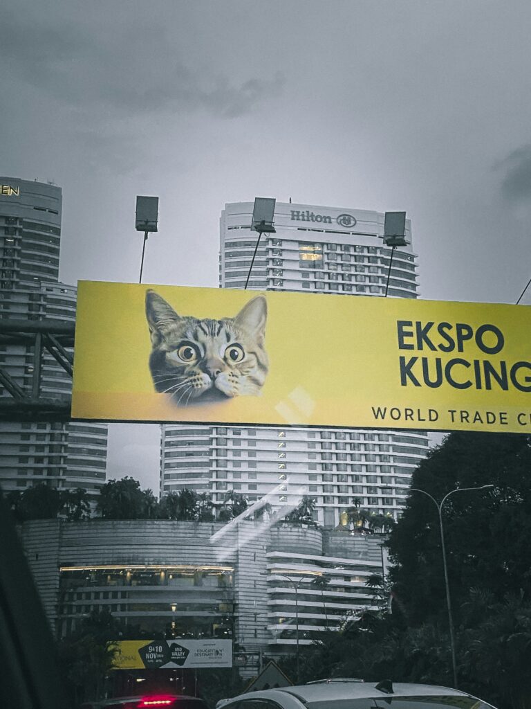
Images can help a banner feel more alive, but they only work when they are sharp and easy to understand. A blurry image weakens the whole banner. Photos should be high-quality, so they stay crisp even when enlarged. They should match the event tone and support the message without confusing the viewer.
Your image should also feel like part of the message rather than a random decoration. If someone sees the picture and understands the general idea instantly, you made the right choice. Always test how the image looks from several feet away. If details get lost, consider a simpler picture that communicates more clearly.
5. Make Sure Your Message Can Be Understood in Seconds
People don’t stop for long when walking through a crowded event hall. A banner that takes too long to understand loses attention quickly. A short message works well because the viewer can read it at a glance. If your message needs explanation, keep that explanation for brochures or conversations.
When someone understands the message fast, they feel more willing to approach your booth. The banner acts like a first handshake. It gives them a quick idea of what you offer and why they should come closer. A strong message is not about using long words. It is about using the right words that feel natural and clear.
6. Use Shapes or Elements That Guide Attention
Simple shapes can help direct someone’s eyes to the parts of the banner that matter most. Arrows, frames, or curved lines can lead the eye from one place to another. These shapes don’t need to be flashy. They just need to support the flow of the design.
Shapes also add structure to your layout. They separate sections and keep the banner from looking messy. When done correctly, shapes help organize information so viewers don’t feel overwhelmed. Testing a few arrangements before printing helps you see what feels most natural.
7. Make Sure Your Banner Fits the Event Space Properly
A banner that is too small gets lost in the crowd. A banner that is too large can look out of place. It helps to understand the event space before designing. Measure the height of nearby booths, tables, and stands so your banner doesn’t feel hidden or blocked. Good sizing helps your message meet the viewer at eye level.
Placement also matters. If your banner leans or sits at an awkward angle, people won’t look twice. Keep it stable, straight, and visible from more than one direction. Testing different placements before the event helps you find the best spot for visibility.
8. Make Sure the Material Works for the Event Setting
Indoor and outdoor events bring different challenges. Indoor spaces often have controlled lighting, while outdoor areas may have wind or bright sunlight. Choosing a material that holds up well makes your banner look better throughout the event. A banner that wrinkles, sags, or bends too easily can distract from your message.
Durable material also keeps the print from fading too soon. When colors stay rich and text stays sharp, the banner feels more professional. The viewer sees the difference right away. You want your banner to carry the same level of quality from the start of the event until the end.
9. Use Lighting to Your Advantage
Good lighting can make a banner much easier to read. Soft lighting helps reduce glare and keeps the text visible from different angles. A well-lit banner looks more inviting and helps the viewer notice it even if the room is dim. You don’t need complex lighting to make a difference. Simple, steady lighting works well.
Lighting also affects how colors appear. Some colors look different under event lights, so it’s smart to check a sample beforehand. This helps prevent surprises that might make your banner look dull. When the banner is well-lit, it stands out even in a busy hall.
10. Add a Clear Call-to-Action That Feels Easy to Follow
A banner works best when it encourages the viewer to take a simple next step. A direct call-to-action helps with that. It can point people toward your booth table, a sign-up sheet, or a product sample. The instruction should feel simple and natural so the viewer doesn’t overthink it.
Your call-to-action should be short and placed where people can see it without searching. When the step is easy to follow, people feel more willing to respond. It turns a quick glance into real interaction. Even a few words can guide people in the direction you want them to go.
Wrapping Up
A banner works best when its message feels clear, simple, and strong from the moment someone sees it. Each design choice matters because events move fast and attention doesn’t last long. By keeping the layout open, the message short, and the visuals easy to recognize, you help your banner stand out in any setting. When your banner matches the space, the lighting, and the mood of the event, people notice it faster and remember it longer. This gives your booth a natural advantage and helps you make a stronger impression throughout the event.


