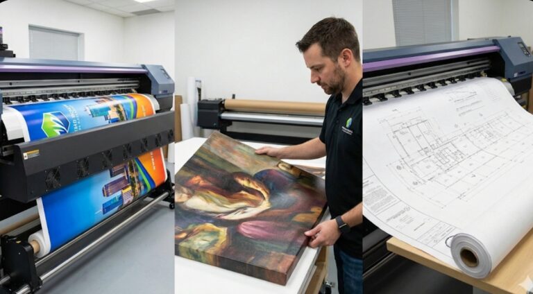
Print quality in large format work goes way beyond just making things look pretty. When you’re producing technical drawings where a millimeter matters, or fine art where color accuracy determines whether a piece sells, the printer technology directly impacts the end result. Large format printers designed for quality-critical applications use different ink formulations, higher resolution capabilities, and advanced color management systems compared to basic models. The gap between adequate and excellent becomes really obvious when you put prints side by side or when clients start comparing your work to competitors.
Resolution and Detail Reproduction
DPI numbers tell part of the quality story but not all of it. A printer advertising 2400 dpi produces finer detail than one running at 1200 dpi, assuming everything else stays equal. But drop size matters just as much. Modern piezoelectric print heads can produce variable-sized droplets, with the smallest measuring just a few picoliters. Those tiny drops create smoother gradients and finer details.
The number of ink colors affects perceived quality significantly. Basic four-color CMYK systems work fine for general graphics, but six or eight-color systems add light cyan and light magenta (plus orange and green on some models) that expand the color gamut noticeably. This matters most in subtle skin tones, light blues, and saturated colors that four-color systems struggle with.
Viewing distance changes quality requirements. A billboard viewed from 100 feet away can look sharp at 150 dpi. A technical drawing examined from 12 inches needs 600 dpi or higher. Understanding this relationship prevents both over-engineering prints and disappointing clients with insufficient resolution.
Ink Technology and Longevity
Pigment-based inks dominate quality-focused applications because they resist fading way better than dye-based inks. Archival pigment inks on proper media can last 100+ years under glass or 200+ years in dark storage. Museums and galleries require this longevity for limited edition prints and reproductions.
UV-resistant inks handle outdoor exposure without degrading. Standard prints might fade visibly within months in direct sunlight, while UV-resistant prints maintain color for three to five years outdoors. The trade-off is slightly reduced color vibrancy compared to indoor inks, but the durability usually matters more for exterior signage.
Latex inks offer an interesting middle ground. They’re water-based during printing but cure into durable, scratch-resistant prints. The heat-curing process means prints come off the machine dry and ready for immediate finishing. Plus, they don’t have the strong solvent smell that makes eco-solvent printing unpleasant in enclosed spaces.
Color Management Systems
Consistent color across different print runs separates professional operations from amateur ones. Spectrophotometers measure actual output and create custom ICC profiles for specific printer, ink, and media combinations. This profiling process takes time initially but ensures a blue specified in a design file prints as that exact blue every single time.
Pantone matching capability matters enormously for brand work. Corporate logos need to match across all materials, and eyeballing it doesn’t cut it. Advanced RIP software includes Pantone libraries and can generate spot color simulations that get really close to official Pantone swatches.
Lighting conditions affect perceived color too. D50 and D65 viewing booths provide standardized lighting for color evaluation, eliminating the variables introduced by office fluorescents or natural daylight. This seems excessive until you’ve had a client reject a print because it looked different in their office than in yours.
Media Compatibility and Surface Quality
The substrate affects final quality as much as the printer itself. Premium photo papers use brighter base stocks and specialized coatings that hold more ink without bleeding. The result is noticeably deeper blacks and more vibrant colors compared to standard papers.
Canvas texture adds character to art prints but can hide fine details. Some artists love the traditional gallery wrap look, while others prefer smooth fine art papers that show every subtle gradation. The printer needs to handle both without clogging or producing banding.
Rigid substrates like aluminum composite or foam board require different handling. Direct-to-substrate printers eliminate mounting steps and produce incredibly durable signage. The print quality on rigid materials has improved dramatically, with new generation printers achieving photo-quality output on surfaces that used to look obviously printed.
Technical Drawing Precision
Engineering and architectural drawings demand geometric accuracy that artistic prints don’t. Line weight consistency matters because a structural beam drawn at the wrong thickness could cause construction errors. Better printers maintain line width accuracy within 0.1mm across the entire print bed.
Grayscale rendering quality matters for technical work more than most people realize. Cheap printers produce grayscale by mixing color inks, which can introduce slight color casts. Dedicated black and gray inks produce true neutral grays critical for professional technical documentation.


